Max Temperature
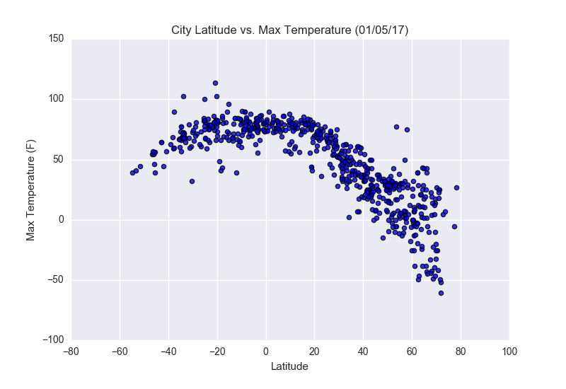
This plot shows the relationship between the latitude and the max. temperature measured in a region. The closer to zero represents the closer the city is to the equator. This comparison is the one that shows the most clear tendency, as higher temperatures are found in places closer to the equator, and the max. temperature decreases as one gets away from it. This is expected, however, there are slightly lower max. temperatures found in the northern hemisphere, which may stem from the tilt on the earth at the time where the time was gathered, and also the fact that the two hemispheres are in opposite seasons.
Visualizations